The Thought Process Behind Making the SNK Site
• A Home Renovation Company • Premium • Modern
This was the first time I took something from a vague idea to a finished website for someone who was trusting me with it.


The project started with a phone call. My client (friend) was just starting his business and knew very little about websites, so he didn't have a clear picture of what he wanted.
Before we talked about the site at all, I asked about the business: what he does, who his customers are, what he wants to offer, and where he wants the business to go. Once I had a feel for the services and the kind of customers he wanted, we picked a color theme he liked.
He asked for four things:
a Projects section,
a Services section,
an About section
and a Contact form.
That was the whole brief.
Before the site
Since he was starting from zero, delivering a website alone wouldn't have been enough. We began with the logo. He wanted something simple, so I showed him a few variations and he settled on one.
Then we did the business card the same way: a few designs, one he liked, and some back and forth until it was done.
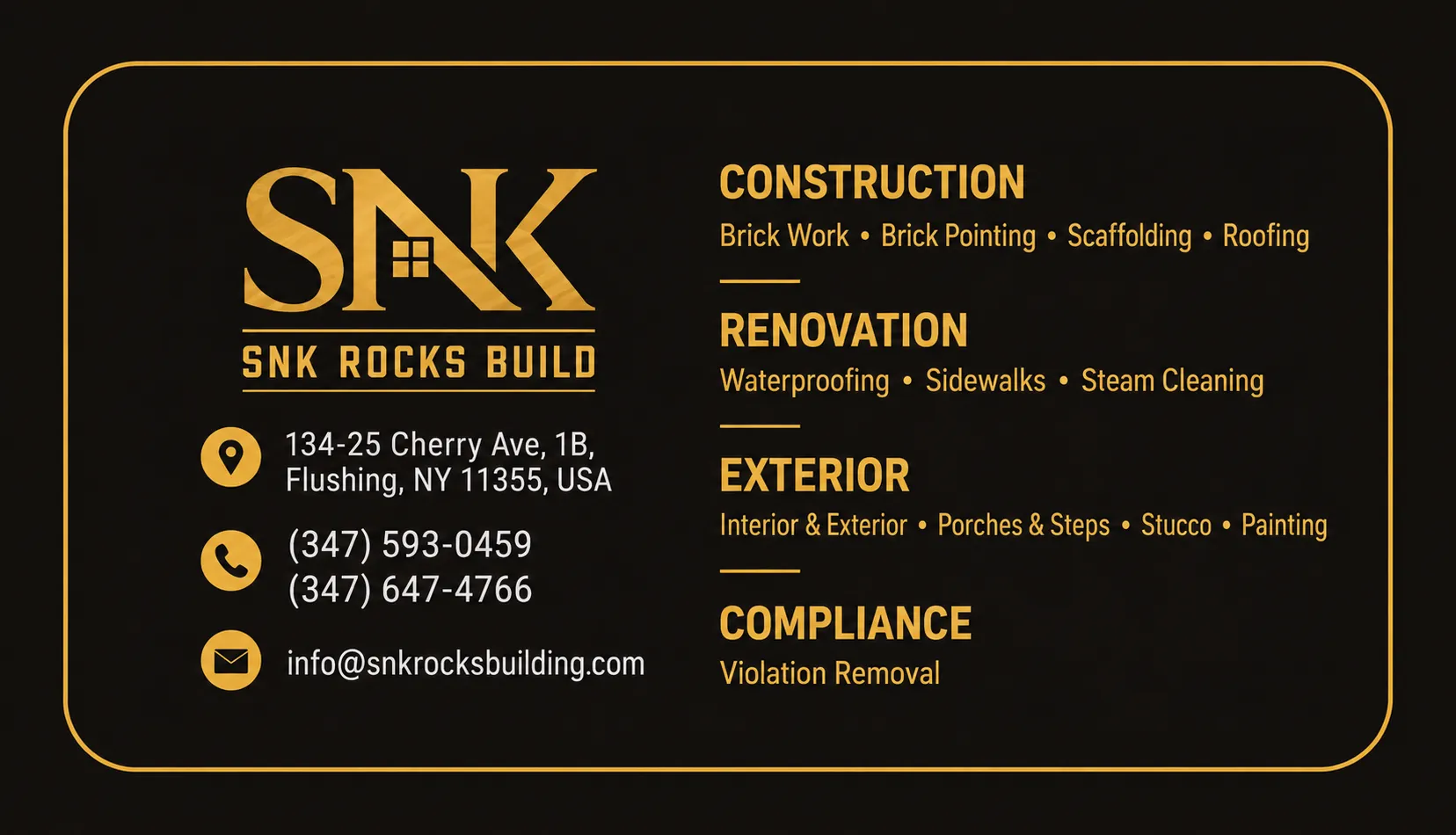
Only then did I start on the site. I understood what he wanted, but I still had to work out what the website needed to achieve, and that raised a lot of questions.
PROBLEMS
Most of the hard parts had nothing to do with the website itself.
The business was new, so there were hardly any finished projects to photograph for the Projects section, and nobody had a firm idea of how the site should look. I also knew the site wouldn't stay as it was on delivery day. New projects would come in, images would be swapped, services might change, and the content would keep growing.
For the Projects section, I created assets based on the services SNK would offer instead of waiting for a library of real photos. But that left another question:
once they had real projects, would they have to call me every time they wanted to change an image? I didn't want that, so I built a custom CMS with Sanity and let them manage their own content. A website shouldn't leave the owner dependent on the developer for upkeep.
Questions
With the problems clear, I kept asking myself things.
- What is the core of the brand?
- What is SNK actually selling?
- What does a visitor need to understand in the first five seconds, and what should they see first?
- What makes someone trust this business?
- How much of that can the site communicate without leaning on text?
- And after someone gets interested, how do they get in touch?
- What happens when the client wants to change something later, or when the business grows?
None of this was about making the site prettier. I wanted it to work for the business.
The Direction
Everyone knows the standard structure: Services, About, Projects.
I wanted to keep that simplicity but still make the experience feel like its own thing, and above all I wanted the site to say what SNK does right away.
So what is SNK selling? Transformation.
That became the core idea of the design. The hero isn't a headline describing the company. Every UI element points at one idea, which is turning an existing space into something better, and the visuals do most of the explaining.
From there I mapped the page to the questions a potential client would have in their head.
What do they do?
Can they deliver?
What does their work look like?
How does the process go?
What do I do next?
That gave me a flow of positioning the brand, explaining the services, showing the work, building trust and making the next step obvious. Because the structure underneath was plain, the design on top could afford to be expressive.
Building
Once the direction was final, I finished the design and then started building. Before writing any code, I wrote the context files my AI agent would need, so it wouldn't hallucinate or drift from what the project actually was. I also adjusted the agent's rules for this specific project.
In total I made nine context files, each covering one part of the project in detail:
00-vision.md
01-contents.md
02-design-system.md
03-website-structure.md
04-animation-plan.md
05-tech-architecture.md
06-security-architecture.md
07-production-policies.md
portfolio-project-details-agent.md
These files kept the project consistent from start to finish.
After that came performance. I optimized images, loading, assets, structure, responsiveness, animations and SEO. Most of this work is invisible, but it matters. I didn't want a site that only looked good in a screenshot, and the only way to know it worked was to test it.
Test & Deploy
When I thought I was done, I asked friends to try it. They found bugs and a few things that didn't behave the way I expected, so I fixed them. Then I asked a friend of my client to test it too. He had no idea how I'd built it or what was supposed to happen behind the scenes. He just used it, which was exactly what I needed. After fixing those bugs and making the changes he asked for, the project was ready.
Then I handed it over. It was his project and he'd paid for it, so my part ended there. I didn't want him thinking about everything I'd been thinking about during the build. The whole reason for my overthinking was so that he wouldn't have to.
Lessons
I'd read a lot about how great websites are made, but reading and doing client work turned out to be very different. These three lessons came out of this one.
1. The visual has to do some of the explaining
For SNK, I didn't want every section to rely on text to say what the business does. The imagery, composition and motion had to show the type of work and its quality before anyone read a word. I'd read plenty about visual storytelling before, but doing it for a real client made it click. A visual can carry information before the user reads anything.
2. Premium doesn't mean complicated
I wanted my first client site to feel unique and cool without hurting usability, so I kept the motion focused in each section instead of scattering effects everywhere. The rule I followed is simple: don't make the user guess. They should always know where they are, what they're looking at and what to do next. A site can be interesting to look at without being confusing.
3. A client site has to survive after you leave
The launch version is only part of the job. The business will change, with new projects, new images and more content, and the website has to grow with it. That's why I tried to build something the client could own and keep using once I was gone.
That's all for now
From the first call to the handover, there was a lot more thinking behind this project than anyone can see on the site. The client doesn't need to know any of it. I overthought it all so he didn't have to.